Benjamin Moore Caliente – 2018 Color Of The Year
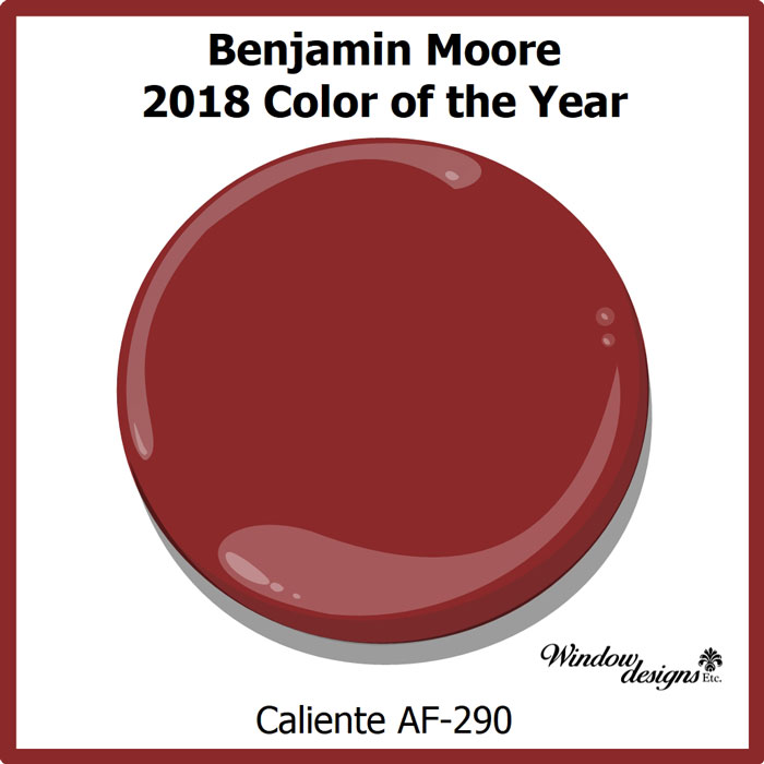
Benjamin Moore Caliente is the 2018 color of the year. Leading paint company, Benjamin Moore made the announcement on October 11, 2017 in a lavishly color filled party at the Guggenheim.
Benjamin Moore Announces Color of the Year for 2018
Pin this ↑
Benjamin Moore Caliente is a rich red with hints of orange. Caliente AF-290 is one of the Benjamin Moore Affinity colors. Affinity colors are known for their depth and richness of color. Caliente is a rich and deep color.
Benjamin Moore describes Caliente as hot, passionate and sexy. They behold it as one of their most loved reds. Caliente, a Spanish word, has lots of personality. It is the perfect hue for you if you like to the warmer tones of red.
Benjamin Moore Caliente Af-290
Pin this ↑
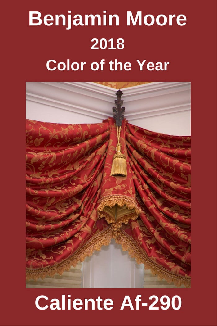
A custom window treatment in a Princeton, MA dining area features an RM Coco fabric in color Caliente. The large eat-in kitchen needed some warming up. The addition of Caliente creates a very warm and friendly family atmosphere. See more details on this kitchen in my portfolio.
Caliente is a ball of fire, like the colors in a blazing inferno. This makes it the ideal color for an accent wall in a family room. The addition of this blazing red will warm up any room.
Bold and brazen Caliente is best in small doses. It captures so much of your attention, a whole room painted Caliente may be too much.
It works best when combined with other color schemes.
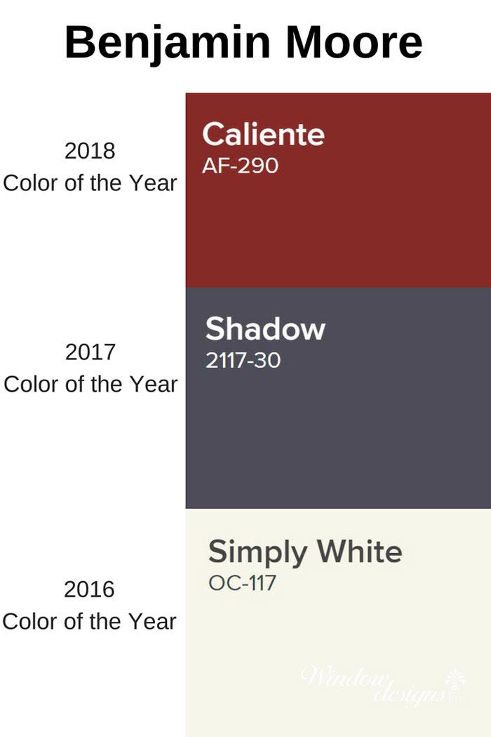
Past Benjamin Moore Colors 2018-2017-2016
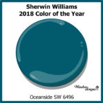
Looking back at the past selections of Benjamin Moore color of the year, Caliente is a welcome change. This change was also noted in the recent selection by Sherwin-Williams of Oceanside as their pick for 2018.
Benjamin Moore Shadow 2117-30 selection for 2017 is allusive and mysterious. (A great color in certain situations, but this is a rather subdued and depressing color to me)
2016 saw a safe and ultra neutral selection of Simply White OC-117. (Talk about NOT wanting to make a statement. Let’s just stay neutral and get along with all the other 3,500 Benjamin Moore colors)
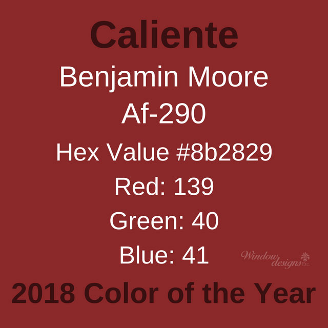
Caliente Af-290 Color Values
Pin this ↑
Ellen O’Neill, Benjamin Moore Director of Strategic Design Intelligence describe Caliente as “Strong, radiant and full of energy, Caliente AF-290 is total confidence. It is pleasing, passionate and makes people feel special, like ‘red carpet treatment.”
Caliente is going to uplift people’s spirits. It’s a happy color and this designer is excited to bring it to your decor.
It’s the perfect color to add warmth to your New England home. I think you’re going to love it!
Designer Note
Benjamin Moore Caliente is their 2018 Color of the Year.
This does not mean you should change all of the walls in your home to Caliente.
Begin adding small amounts of the IT color into your home and even your wardrobe.
A pillow here, a throw there, some pottery or fresh towels for the powder room.
Keep your eyes open for this new color. You will begin noticing it everywhere.
***Please be aware that computer and mobile device screens display color differently than in person***
Contact me if you would like your own paint swatch.
I’m ready to help you bring Caliente into your home and office.
- October 12, 2017
-
Marie Mouradian
Comments are closed.
Never Miss An Update
Search this site
Share
Window Designs Etc.
Service Area
Bringing custom window treatments, shades, blinds and interior design services to your home and office in the Worcester, MA area including Holden, Leominster, Gardner, Sturbridge, Webster and beyond.
© COPYRIGHT 2025 WINDOW DESIGNS ETC.



Another great color when used in the right instances.
I agree, Cleopatra! It is a pretty powerful color in large doses.
Thanks for checking out my blog 🙂
Ok I definitely prefer Oceanside because I’m on this coastal vibe now and all about relaxation and peace. I think I like just saying caliente!!
Ha, saying Caliente even sounds like a hot party!
Isn’t it amazing how opposite Caliente and Oceanside are?
Thank you for visiting the blog 🙂
I’m not a fan of their choice this year. Totally prefer the Sherwin Williams color.
Benjamin Moore’s Caliente and Sherwin Williams’ Oceanside are on the opposite sides of the warm/cool spectrum.
You’re a “cool” girl!
Thank you for checking out the blog 🙂
It’s going to take awhile for this one to grow on me, I think.