The Emotions of Color
This color psychology article was originally written for my email newsletter ~Beautiful Home and Life Design~ to educate my clients on why the colors we choose to decorate with have an emotional effect on how we feel in the room.
Color has the power to change our mood
What is color psychology? Color energizes, it calms, it soothes, it provokes, it stabilizes, it softens, and it creates chaos. Playing with color is playing with your emotions. We use color to lift our spirits, to inspire us and to make our homes feel safe and warm. The culture we live in and our personal history define color associations.
Color Psychology
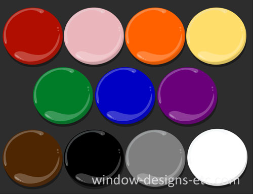
Red, Pink, Orange, and Yellow – The Warm Colors
Red is the color we pay the most attention to. It is the most energetic color, it’s hot and dramatic. Red is the color of love, passion, and desire; red hearts, red roses. A “red-letter day” is terrific; wearing a “scarlet letter” marks you as untouchable. On the flip side, red is for danger, speed, and anger; think of stop signs. It increases the heart rate; you won’t find it in the emergency room. It stimulates the appetite; you will find it in most food establishments. Have you ever gone into a pizza place or Chinese restaurant that wasn’t red?
Pink is soft, sweet and secure. Hot pink is playful and assertive.
Orange has become a lot more acceptable in the past few years. Bright orange is loud and flamboyant. Orange is the color of affordability; think Home Depot and ING, it appeals to the masses. Warm terracotta, apricots, and peach tones are more sophisticated. Fall leaves, pumpkins, and Halloween come to mind when you think of orange.
Yellow is warm and friendly. It inspires. Energy, joy, happiness and hope are associated with yellow. Yellow creates a glow even in the darkest rooms. Like the sunshine, yellow is warming but too much of it can be burning. Bright yellow causes tension and stress.
Cool Colors – Green, Blue, and Purple
Green is the color often cited as a favorite. It represents nature, health, money and prosperity. Green is cool, calm and healing; think of a spa. Hospital scrubs are usually green. A negative effect is jealousy; being “green with envy”. It’s good to be “seeing green” (money); and bad to be “turning green” (sick).
Blue is tranquil, calm, stable and secure. Blue is the color most used in business to show reliability, integrity, and trust. Navy blue demands respect. Blue slows the pulse, lowers the body temperature and reduces the appetite. A great color for a weight loss clinic.
Purple represents royalty, dignity, and spirituality. Purple is an exotic color. There is a fine line between a spiritual ceremony and magical mystery. Purple is imaginative and creative.
Brown, Black, Gray, and White Color Psychology
Brown is down to earth, warm and secure. Lighter shades of beige and taupe are classic neutrals. Deep browns add richness and depth. Browns are generally appealing to everyone.
Black is another mysterious color. In the spectrum, it is the absence of light, therefore, no color. Formal, elegant, sophisticated and sexy black is in contrast to the black of death, mourning, and witchcraft. Black is a great accent color.
Gray is the most neutral. Gray has quiet strength and longevity; think granite and metal. Gray is timeless. It is best as an accent.
White is what we see when all the colors come together in perfect balance. White is pure, simple and clean. Reverence, peace, and joy are evident in white Easter lilies. Every color goes with white. Too much white can be uncomfortable and hard on the eyes.
My daughter’s Marketing class at Bryant University discussed the psychology of color today.
Now that you know the emotions behind the colors, can you think of any instances where color played a part in your buying decision?
Have you ever walked into a room and felt uneasy because of the color?
What colors surround you?
What color would you never be able to live with? Why?
Please leave a comment below. How does color affect you?
Did you know that you can contact me for a one-hour consultation to be sure you get the color just right?
Contact me today to begin the transformation of your house. Hiring a professional saves you time, frustration, and money. You and your house or office deserve it!
- September 17, 2012
-
Marie Mouradian
Never Miss An Update
Search this site
Share
Window Designs Etc.
Service Area
Bringing custom window treatments, shades, blinds and interior design services to your home and office in the Worcester, MA area including Holden, Leominster, Gardner, Sturbridge, Webster and beyond.
© COPYRIGHT 2025 WINDOW DESIGNS ETC.


