Rose Quartz And Serenity Blue For 2016
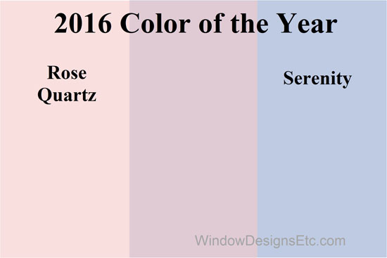
Rose Quartz and Serenity Blue are Pantone 2016 color of the year! Pantone, the leading authority on color, made the announcement early this morning.
It’s twins! This is the first time Pantone has chosen two colors to share the spotlight.
This is a softer take on color for 2016 and I LOVE it!
Pink is my signature color. Rose Quartz is very close to the blush pink in my blog heading and the background design.
Read more about my love for pink.
.
Rose Quartz and Serenity Blue are meant to be used in conjunction with one another.
The Executive Director of Pantone Color Institute describes Rose Quartz and Serenity as “An inherent balance between a warmer embracing rose tone and the cooler tranquil blue, reflecting connection and wellness as well as a soothing sense of order and peace”.
Homeowners often tell me they want their rooms to be warm, inviting and peaceful.
We are looking to our home to be a secure and calm respite away from the modern day stresses of the world.
That’s what your home should be. A place to be at ease and be nourished by an inviting environment.
.
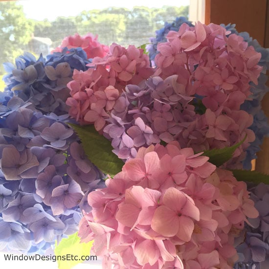
Cape Cod hydrangeas in shades of soft pink, cool blue and their blend to a light lavender.
Nature always gets it right!
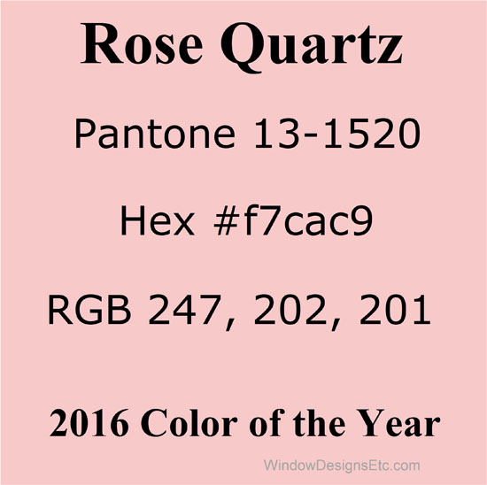
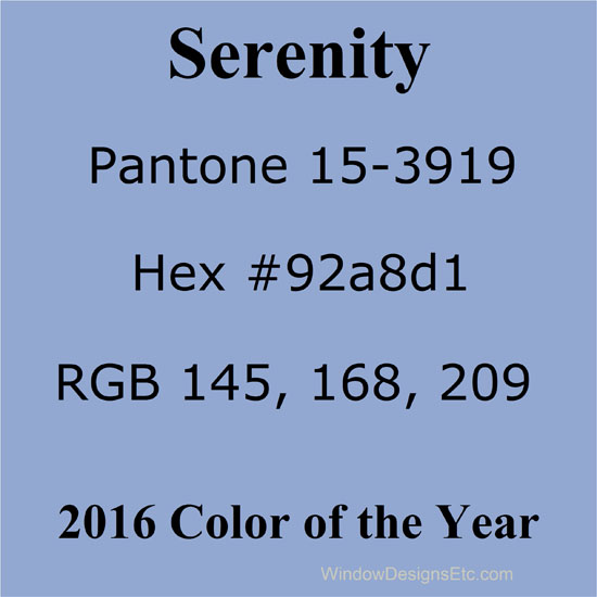
Rose Quartz and Serenity Blue Color Values
Color values of Rose Quartz and Serenity in Pantone, Hex and RGB
I often use the color’s formula when producing design renderings with my graphic design software.
It helps the client to visualize the completed room.
While it will never be the exact color on the screen or phone, it is a close representation.
Defining Rose Quartz and Serenity Blue
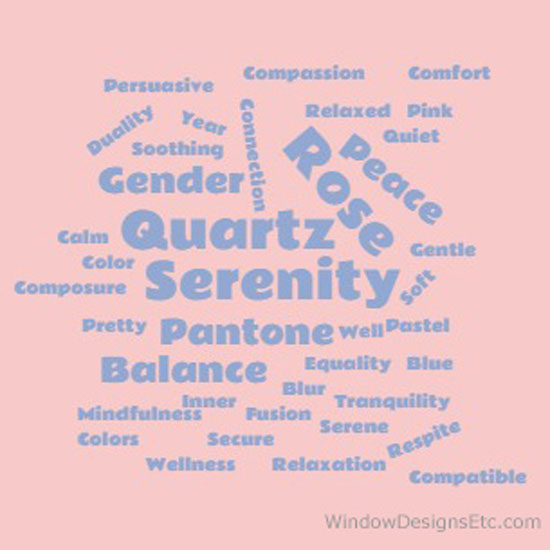
A collection of descriptive words for Rose Quartz and Serenity, Pantone 2016 Colors of the Year.
Rose Quartz and Serenity are described as a fusion of colors that exemplify wellness, balance, calm, compatibility, duality, tranquility, mindfulness and security.
Read more of why Pantone selected Rose Quartz and Serenity Blue for the Color of the Year.
Pantone decides on the Color or Colors of the Year by forecasting the upcoming trends.
They study global markets, events, behaviors, market trends, news stories, developments and yes, politics.
The sky turns to a breathtaking combination of rose quartz and serenity blue at sunset. This is depicted here in the ceiling at The Venetian in Las Vegas, NV. A comforting respite from the noise and activity of a playful city.
We’re looking to our homes for comfort and relaxation, a quieter feeling, like a serene sunset.
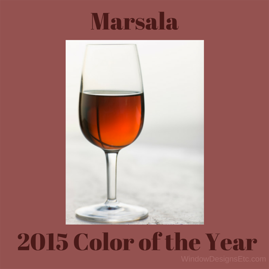
Pantone 2015 Color of the Year
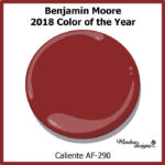
This past year’s color was Marsala. A redish brick color that is welcoming and friendly. Marsala works nicely with the softness of Rose Quartz. Serenity used as a contrasting accent color would balance out the color scheme.
For 2016, I’ll keep a close watch on Rose Quartz and Serenity.
Pin this to Pinterest to refer back to.
Visit the Pantone 2016 Color of the Year Pinterest board to see more examples of these popular colors.
Where will you use Rose Quartz and Serenity in your home?
Did you find this post interesting?
What did you learn?
Please share this with your friends on Social Media (buttons are below)
xoxo
Marie
Contact me today, I will guide you in the best decisions to make your house into a home you love to live in.
Hiring a professional saves you time, frustration and money. You, your family, your house and office deserve it!
- December 3, 2015
-
Marie Mouradian
Never Miss An Update
Search this site
Share
Window Designs Etc.
Service Area
Bringing custom window treatments, shades, blinds and interior design services to your home and office in the Worcester, MA area including Holden, Leominster, Gardner, Sturbridge, Webster and beyond.
© COPYRIGHT 2025 WINDOW DESIGNS ETC.
